
This project details the process of designing a white-label app that serves as a digital wallet for people and staff attending events. It works within the native events apps without requiring a new install. It’s being developed by an Irish start-up in the digital payment business. This prototype was created for the UX Design module in Technological University, Dublin.
To fit the purpose of the app, this prototype takes the Web Summit as the brand (logotype and colours) and native app. Within the app the attendees are able to top-up their wallets, redeem tokens for free or promotional items,check their transaction history and check which vendors are actually taking the digital wallet as a form of payment.

Register (QR Code)
Register the attendee in the app by generating an unique QR and pin codes. Top-up, balance,
tokens will be assigned to this QR Code.

Top-up
In order to let the customer pay and see the balance on their wallet, a top-up feature is needed and it’s the most
important feature on the app.

Check Balance
Being able to check the balance is an important feature to the customer in order to manage their budget.

Tokens
The tokens are what differentiate the app from its competitors; it gives the customers free promotional items on
their wallet and visibility/publicity for the vendors.

Refund
The user is able to cashout the amount they have left on their account.

Transaction History
The app is a transparent digital wallet so the attendees and event organiser can keep track of what has been spent.

Google Pay
One of the most used digital wallets available
and compatible with the Android and iOS system.
The app stores the card information on the
user’s phone and does not share any information
with the vendors. It uses the NFC technology for
contactless payments and it’s one of the most
accepted digital wallets in the market.

Apple Pay
Apple Pay is the native digital wallet available
for iOS devices. It is one of the safest as well
as it uses Touch ID and Face ID as alternatives
for validating payments. Such as the Google
Pay app, it also uses NFC for contactless
transactions in-stores.
Paypal Mobile
Available for both Android and iOS devices,
Paypal Mobile brings their payment concept to
mobile devices: send money, receive money
and pay for goods online. Paypal focus on
online shoppers.

Zapper
Available for both Android and iOS devices,
Zapper uses QR Codes to generate fast
payments, and the app includes the feature
of splitting the bills amongst other people. The
business needs to have Zapper available to
print the QR Codes on the bills.


The homepage serves as the wallet of the event, therefore it holds the main tasks such as Top-up, Refund, Tokens and Latest Transaction History.
In order to deliver a seamless User Experience I’ve studied Material Design, a Design Language created by Google to create consistency, minimalist and responsive Design within their apps. It helped me create consistency within fonts, iconography, colours, buttons and cards. I've followed the principle that often we don't need to teach a visitor how to relearn something completely new in order to do a task. Material Design was the perfect framework to follow.

Top-up wallet

Refund

Tokens

I've also studied Fitts’ Law to create the bottom menu tabs. Fitts' Law correlates the time to perform a task to its distance and size. If something is small and far away, it shouldn’t be a priority task. Thinking about this logic, this app prominently features the main menus on the bottom of the screen as tabs and places the secondary options (such as Settings and FAQs) on a hamburger menu on the top left. Leaving the app is also a secondary task, placing the Exit button smaller on the top right. The tabs link to the QR Code, used for payments, and the Event Info, displaying information about the vendors using our wallet.
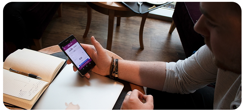
With the test ready and running on an Xperia Z2 mobile phone, the experiment was done on a local Starbucks using the “think-out-loud” technique: as the users test the app they were requested to say out loud what they are doing and what they are thinking for documentation purposes.

Paul, 24
Paul uses his smartphone quite a lot, so my
observations concluded that he was very intuitive
about what he was doing in the app. He spoke
out-loud everything he was doing and questions
he was asking himself about what to do next. His
User Testing revealed that if a button is hidden by
scrolling it could make the user question if he’s
doing something right – when topping-up a certain
amount the confirming button should be as visible
as possible.

Andy, 31
Andy was the most successful user through the
entire tasks and he’s daily very concerned with
safety. This app gives option to people that saves
everything on their phones and people like Andy
that avoids storing personal information. He
comments that he loves the Transaction History
screen. He also pointed how the buttons are easy to
spot as well and that he would be able to use app
in real-life situations.
Padraic, 21
Padraic entered the coffee place with a huge
headset – that was my excuse to actually ask if he
frequents music events. He says he goes to music
festivals whenever he has the chance. He found the
app easier to use than another banking app he has installed
on his mobile phone.

Click on the image to test this prototype!
The general user feedback could classify the User Interface and User Experience as very successful, having achieved their goals and reaching a success rate of 91.6%. This prototype was also designed taking into consideration the development process, since it does not require many complex animations and memory-heavy assets such as high-resolution JPEGs and videos.The high-fidelity prototype was designed using the Sketch software for design, Invision Studio software for prototyping Material Design animations and published on the InvisionApp web prototyping platform. You can interact with the prototype here.


