Case Study: The Senior Room
The Senior Room is an Award-Winning web-based interactive experience bringing awareness about older people in Ireland, their stories and the work of charities that work for their well-being. The project had the support of two charities: ALONE and Friends of The Elderly.
Project Overview
On this responsive website, visitors are invited to enter the participants homes and/or related places, immersing into a 360 degree environment where they can find interactive hotspots guiding the users through their stories in the shape of videos, text and photography pop-ups. We wish to provide an alternative for charities to spread their message throughout social media and awareness campaigns with regards to loneliness, depression and physical limitations within the older people in our community. Older people often lack a source where they can share their stories due to the digital divide and this is an opportunity to bring these stories to the digital platforms.
Participants
The project is an online campaign releasing four to five rooms in 2019, with each participant representing a different charity. The first room available presents John, a gentleman that brings joy with his band to Friends of The Elderly headquarters on their Wednesday Clubs, where volunteers and older people are in to dance, meet friends and enjoy the company and hospitality of the charity’s volunteers.
The second room we welcome visitors is Annette’s living room. Annette represents ALONE and speaks about her younger years, the benefits of having a befriending volunteer and how the charity helped her cope with depression and loneliness.
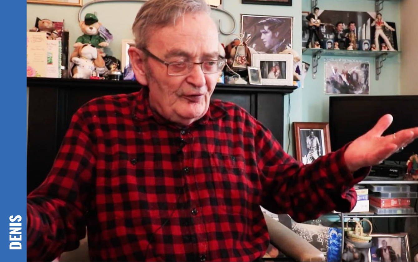
The third room to be released is Denis’ living room, representing Friends of The Elderly. He is a gem in Irish heritage with stories of childhood (including the fact that he was the first person successfully treated with Penicillin in Ireland), Rockabilly memorabilia and his journey as an Irish Postman.
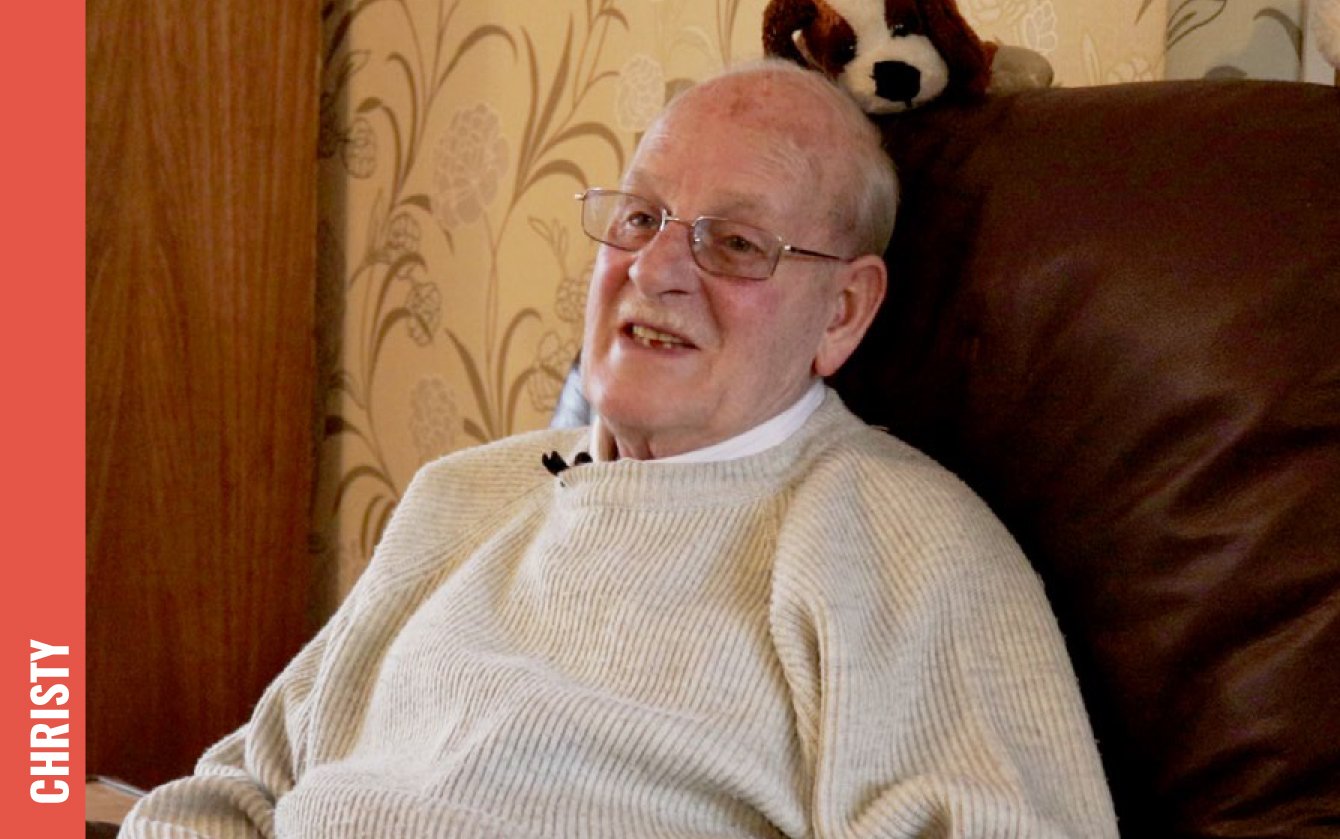
The fourth room to be released is Christy's living room, representing Friends of The Elderly. He is the drummer of the Wednesday’s club band and he plays the drums also in his house. He’s affiliated to Friends of The Elderly it’s been over ten years and stays active with his music and swimming.


Influences


The Senior Room was inspired by online campaigns, such as the Christmas Memories video produced by ALONE and available on Youtube. In this video, older people are invited to tell anecdotes of their past Christmas. Their campaign brings awareness about loneliness during festi ve ti mes, where families are supposed to be together and older people spend it alone. The charity works on bringing them to dinners and even bringing christmas trees to this vulnerable demographic.
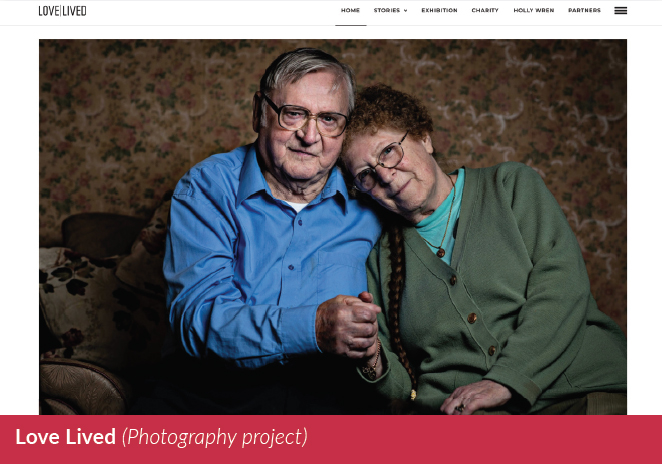
The second inspiration was the photography project by Holly Wren, Love Lived The british photographer captures images of couples of older age and share their romantic stories. She also recorded videos of the participants telling these stories and giving advice for younger generations. The Senior Room is inspired by the sense of empathy we feel by older people telling stories that we might be going through right now.
The Channel 4 program Old People’s Home for 4 Year-Olds is based on an experiment. Children are brought to their nursing homes in order to spend part of their days with the older people doing planned activities. The show brings scientific explanation to why bridging both generations is benefitial to all participants: Children develop their vocabulary and empathy, while elderlies display improvement in relation to depression and physical responses.
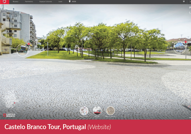

In terms of project execution, the project took inspiration from three interactive 360 degree websites. The first one being the Castelo Branco Tour, a city in Portugal. The website takes the visitors through different parts of the cities and shows hotspots with text and photos of the monuments, parks and buildings.
The Salvation Army Open Home interactive project was created to bring awareness about poverty in New Zealand and how sometimes the signs of it are not very clear. We are taken into a house and interact with hotspots in all the rooms available, reading about data of poverty and the work the Salvation Army has done to help decrease the levels of poverty in the country.
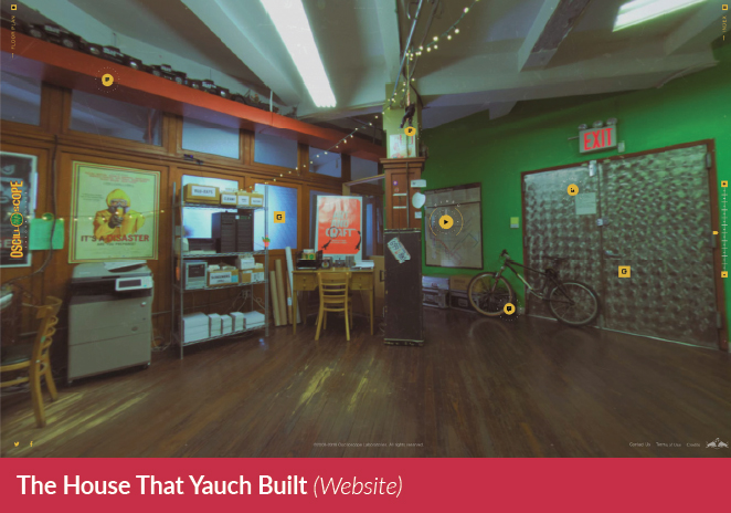
The House that Yauch Built is an interactive 360 tour on Beastie Boys’ legendary Oscilloscope studio. The hotspots brings videos, photos and testimonials of celebrities that made part of Besti e Boys’ stories and interviews with the band members.
The Senior Room took the shape of a virtual tour to bring the audience closer to the older people’s reality and the work the charities do. Annette, for example, invites us to her house, where ALONE works to make her feel comfortable with befriending volunteers visiting. While John brings us to the Friends of the Elderly headquarters, where older people all around the county comes weekly to meet friends, drink tea and enjoy live music.
Volunteering
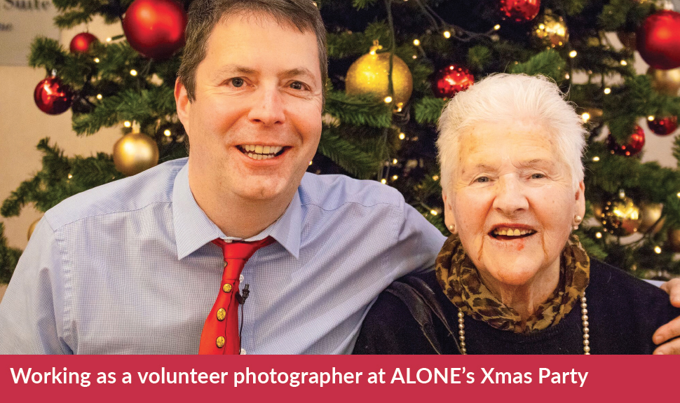


The approach taken to the project was based on Design Thinking, where I would first need to empathize with the charities and the people involved. Each charity, although providing similar services, works differently. I’ve decided to visit ALONE as they are the largest non-profit involved with the cause, and visit Friends of The Elderly as I would have the chance to meet the elderlies on a weekly basis. I’ve taken the approach of becoming a volunteer and offered my services as a photographer and videographer in exchange of getting their help during the entire project duration. I’ve also applied for Garda Vetting in order to kick-off the project without taking staff time. At the same ti me I was reading reports such as the National Loneliness Taskforce and marketing campaigns from ALONE as supporting research.
Sketching & Learning


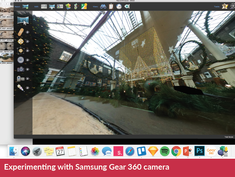
Gaining the charities’ support was essential before moving to a technical format. I’ve taken a 360 degree camera and started experimenting inside my own house and at public spaces such as the Powerscout Centre (where I’ve filmed ALONE’s Christmas Campaign).
During the same phase I’ve paper-prototyped a living room with interactive hotspots and transferred to the SketchApp in order to create a high-fidelity prototype with menu, logos, images and sample text.
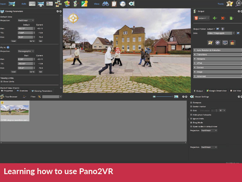
The tool chosen to develop the project was Pano2VR, a virtual tour creation software. I’ve never done anything like this project before, so I was learning how to use the tool throughout the first semester of the project. Videos, icons and photos were edited and created on Adobe’s Suite softwares.
Tools


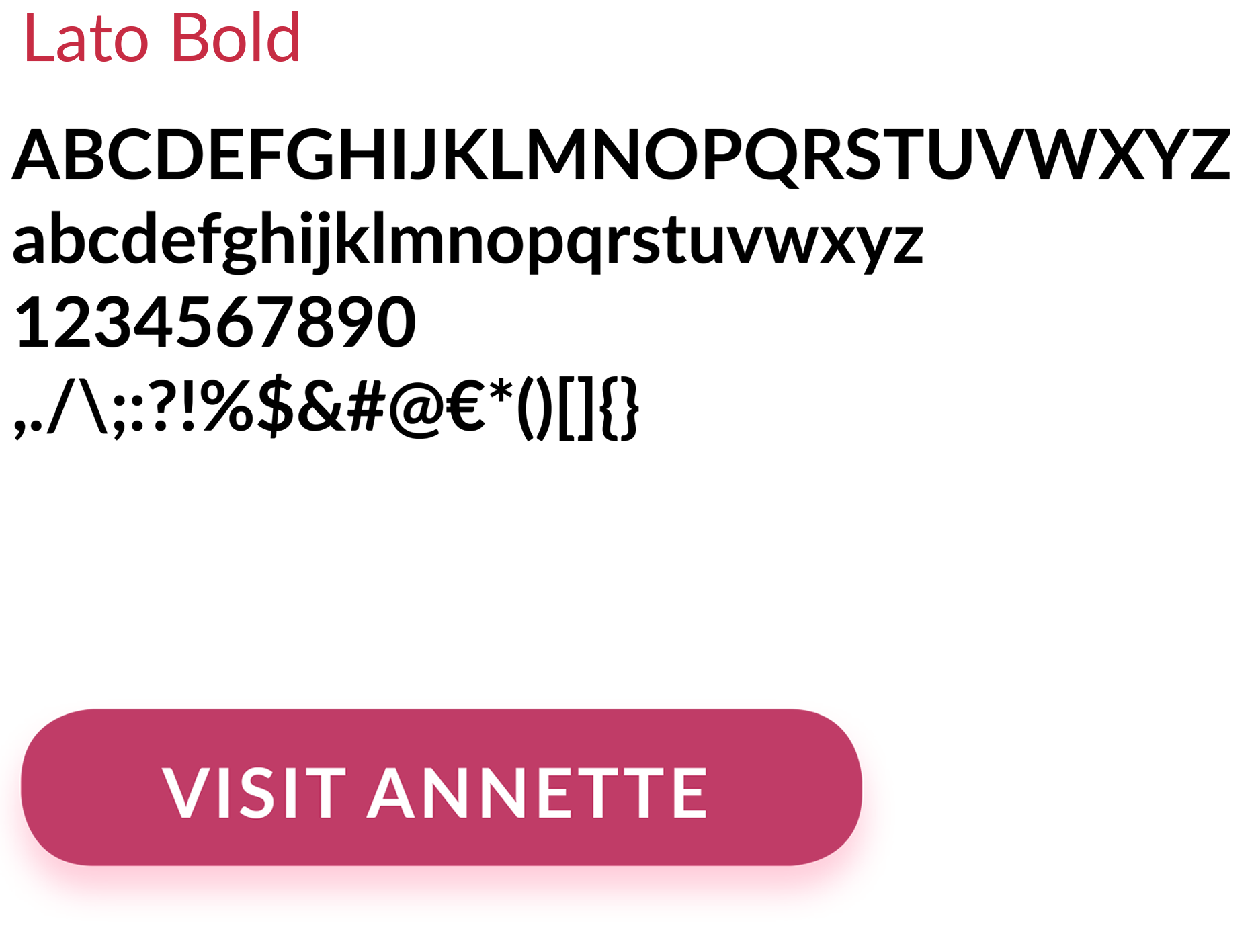
Typography

Homepage Design & Development
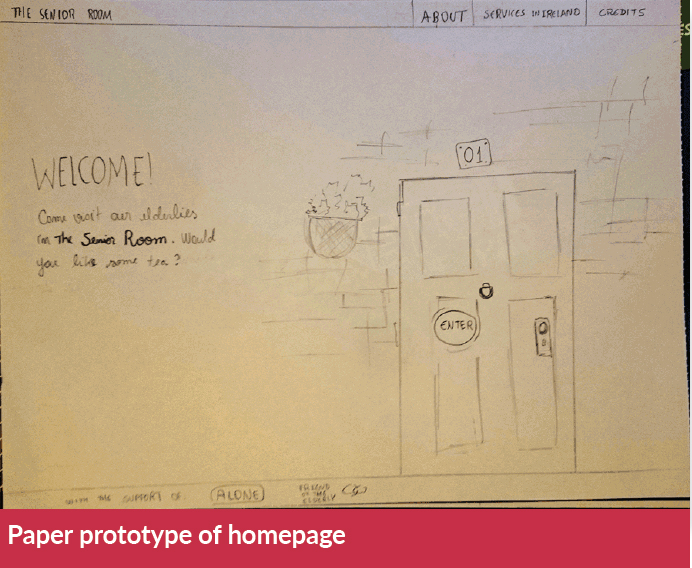
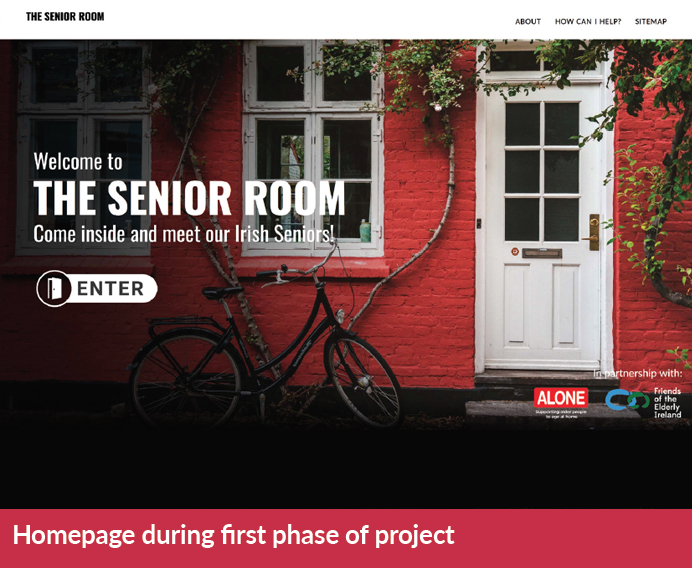
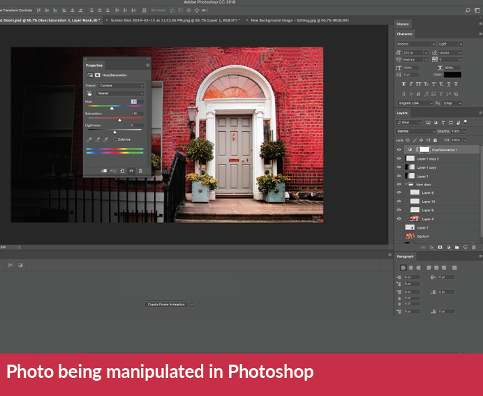
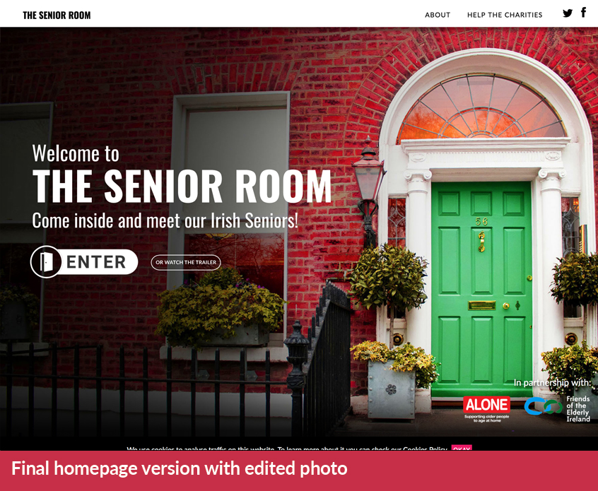
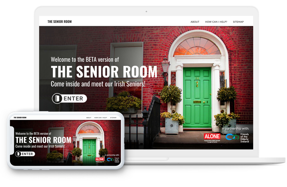
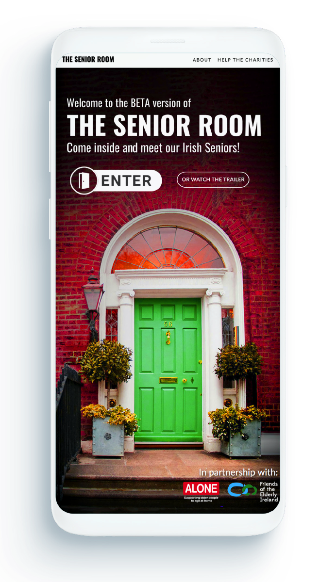
The Senior Room should be an interactive website where people would feel welcomed into the older people’s homes or charity headquarters, so the official image of the project is a front door. During the first phase of the project I’ve researched for stock imagery that would be used as a mock-up and placement before going out in the streets of Dublin looking for the perfect door. Since the project is about Irish Seniors, I’ve decided to then use a Georgian architecture as influence.
During the second phase of the project I’ve visited places like Stephen’s Green square and Fitzwilliam Square with my professional camera. I’ve taken pictures of various doors of different colours, but I’ve decided to use a neutral colour door in Fitzwilliam Square and manipulate it on Photoshop to make it look unique, with a vibrant background and green wood. This would fulfill the Georgian style and the clue to Irish background. The final homepage was developed with HTML5, CSS and Javascript on Atom, a text editor focused on development.
Interface: Choosing Room

Being able to choose which room to visit when entering the website gives the user the power over the experience. The interface was created with principles of Material Design, a Design language created by Google.
The use of separate cards, one for each room, helps the user separate each information in different blocks. Each card also has a button with shadows and one colour for each participant. Throughout Homepage and Choosing Room interfaces, we can see items that are persistent such as the top menu with the buttons “About” and “Help the Charities”, which displays information about the project itself and each charity. The bottom-right section of the interface displays the partner logos, and clicking on them will redirect users to each specific website
Interface: Loading & Tutorial


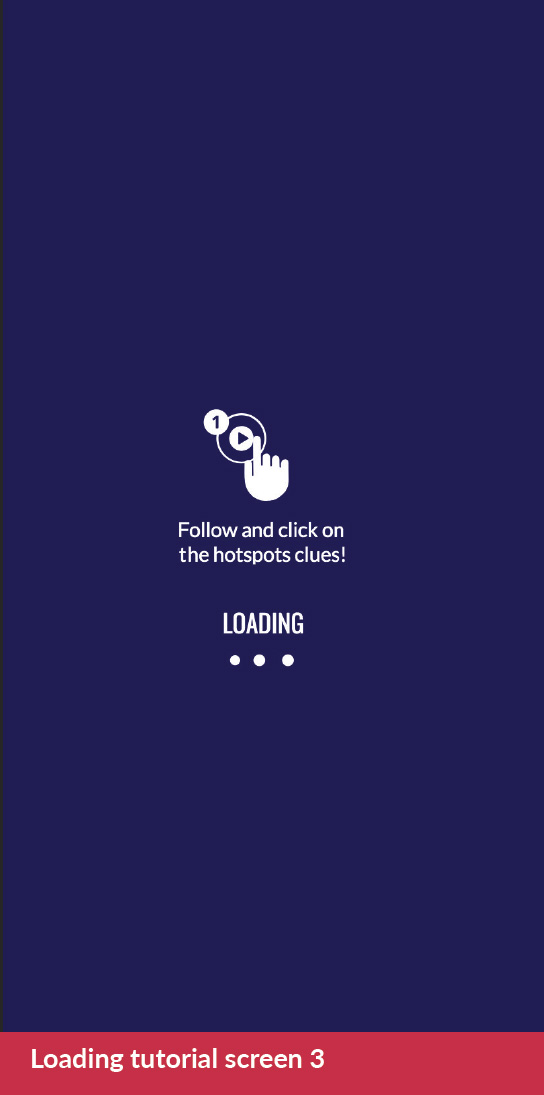
In order to load all the assets necessary I’ve decided to add a ‘fake’ loading screen. Before user testing, I’ve assumed only displaying the ‘Loading’ text was enough, but during tests I’ve noticed (and heard) that the screen seemed to take longer than it actually was. I then decided to move all the tutorial to the loading screen with 3 seconds between each step (three steps in total), giving this loading time a purpose. The screens display that: 1) Headphones are recommended since the experience involves sound; 2) Click and drag, as this is a 360 degree experience and 3) Follow the user-guided experience with numbers and hotspots.
Interface: Elements
 Click here or on the image above to see it larger
Mobile Versions
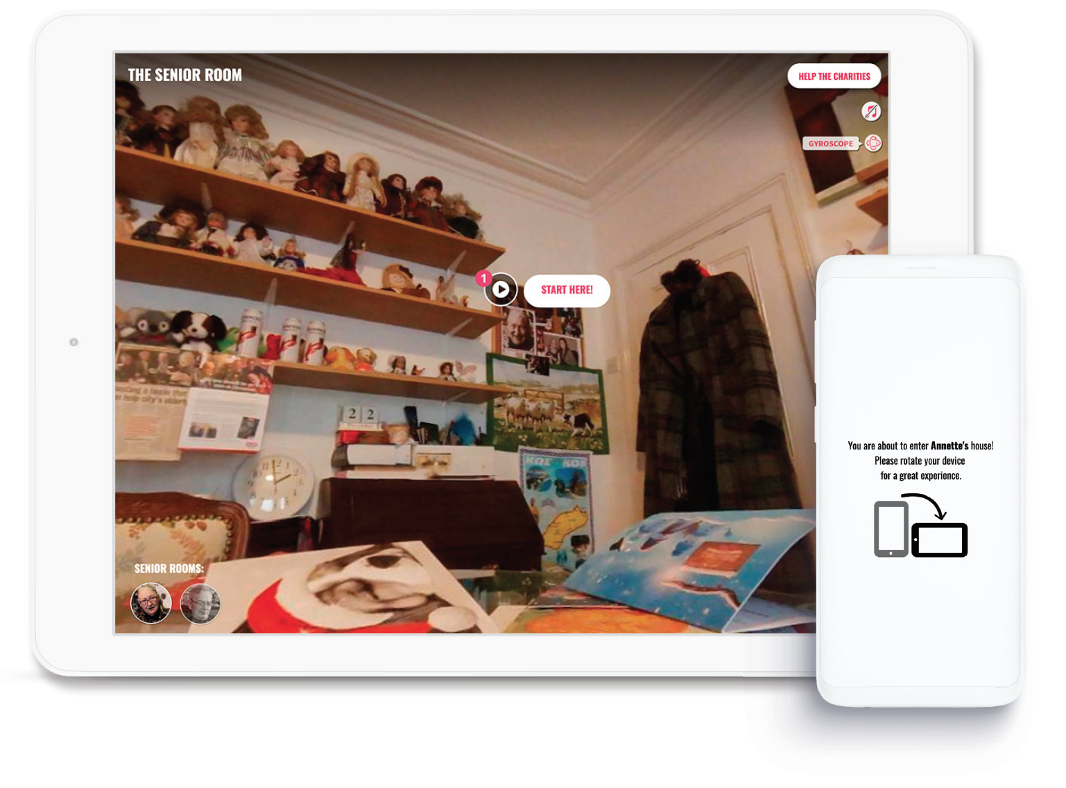

The mobile version of the project works across Android and modern iOS devices. The user interface is reduced with no charity logo (to avoid clutter) and displaying the Gyroscope icon, which permits users to immerse in the room with moving the phone instead of clicking/taping the screen to observe the environment. The iOS version hides the option of ‘Entering Fullscreen’ since their native browsers has an alternative method for fullscreen, which is embedded on the iOS interface. The mobile version also displays a message to rotate the screen after loading each room.
User Tests

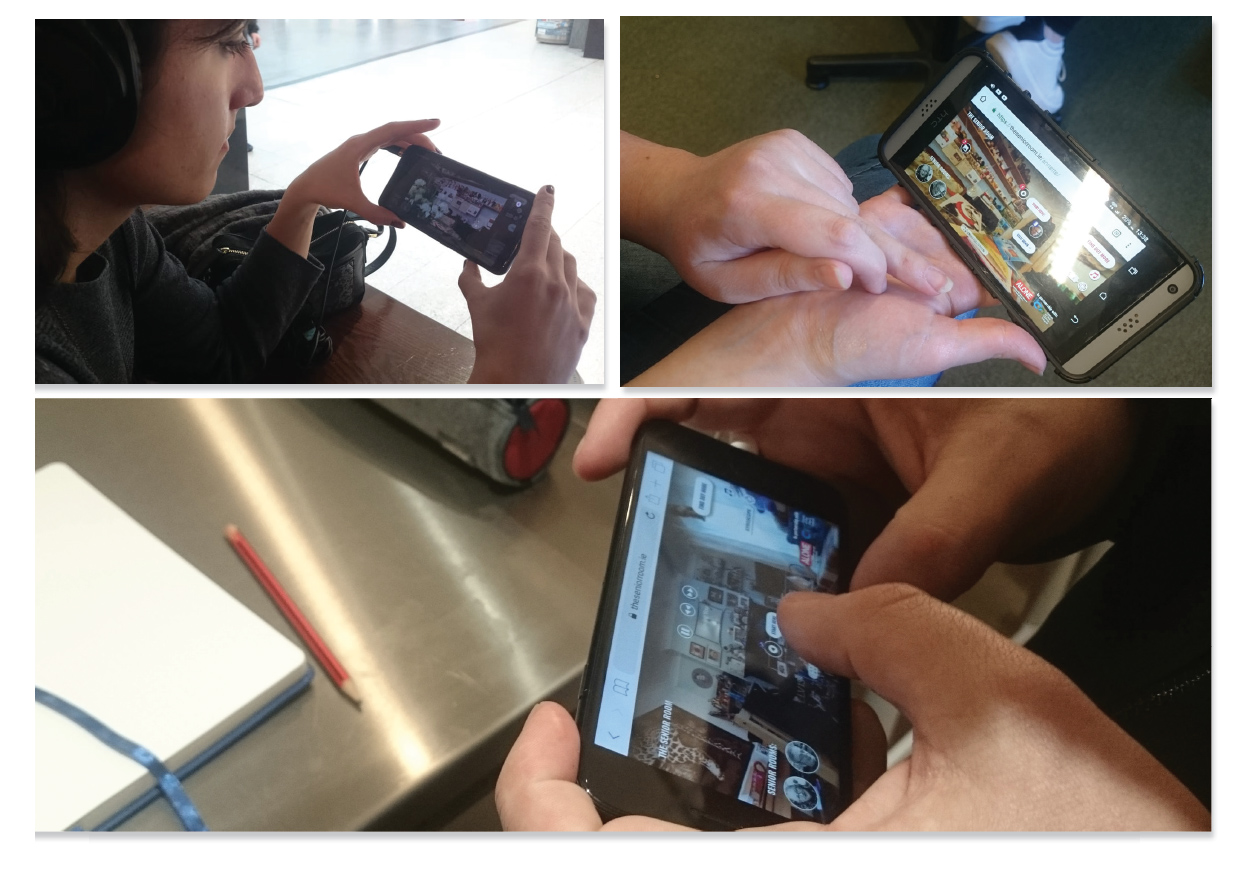
A total of 5 participants were the key user testers. The tests were held with people I’ve met in various Design events. They were chosen due to their high interaction with technology and use of social media, being part of The Senior Room’s target audience. The test was held following the Lean UX methodology; a set of tasks was scripted and put on a Google Spreadsheet and was placed to test the assumptions done during the development (such as best button placement for users) and validating them through observation, users speaking-out-loud and rating how successful they were on each assigned task.
Awards and Press
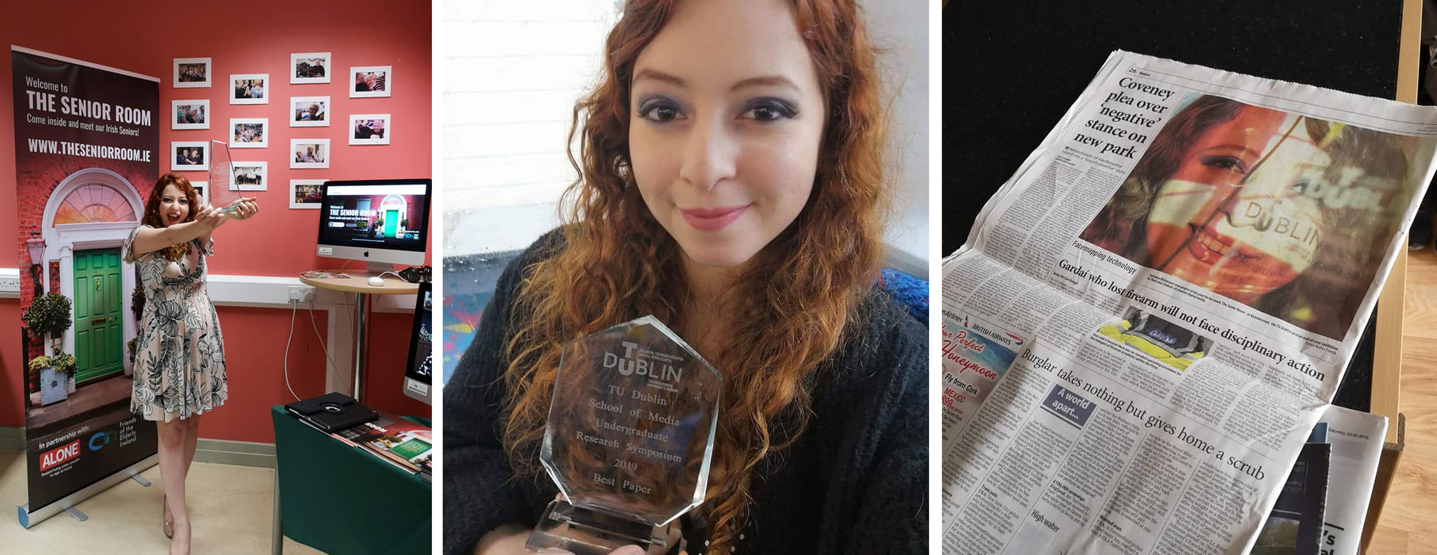
The Senior Room has been awarded Best Project of The Year at the Kaleidoscope 2019 event hosted by Technological University Dublin - Blanchardstown Campus and Best Paper at the Research Media Symposium hosted by the Technological University Dublin. It has been gaining recognition also in the press, such as a feature at the Irish Examiner.
Conclusion
The goal of this project was to inspire people to make a difference. Spreading the message is the main purpose of this project and the charities have contributed by providing me with participants and sharing the project on their social media. The most valuable aspect of the project is how it affected me as well: I’ve made friends during the interview and screening processes. Each person is unique and brings their quirkness into the world, and being able to see these people through an inside lens was eye-opening and broke many stereotypes during both semesters. This is the exact impact I would like younger people to feel: We are able to empathise through kindness, which is one of the few things many of our elderlies ask for.
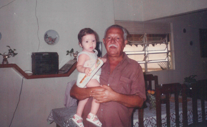
This project is a dedication to my late grandfather, Simonedes Bittencourt. A man who dedicated his life to the well-being of his family. I’m thankful he lived a life where he always had a house full of people to bring him joy. I wish every person alive has the opportunity to spend their lives surrounded by people they love and people that appear during their journey through fi ghti ng loneliness. I would also like to thank my supervisor, Nicola Duffy, and the Creative Digital Media department at TU Dublin - Blanchardstown Campus for all the support and recognition during this project.
